Focus on Landing Page Design | How to Create High-Converting Landing Pages
Reading Time: 7 minutes
Are you looking to create a high converting landing page design? Want to explore some page design basics? You’re in the right place! Here’s a complete anatomy of landing page design to help you create stand-out landing pages.
This article is Part 1 of 3 in our 3 Step Guide to Create High-Converting Landing Pages.
But if you haven’t been getting the results you want from your landing pages, there is a glaring reason why: your landing page design skills need work.
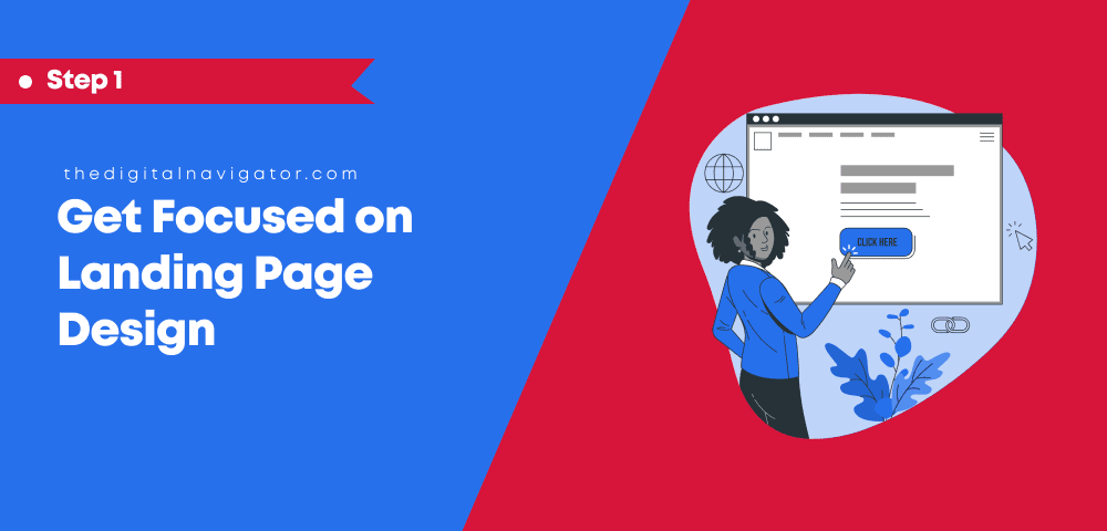
Table Of Content
Think of the last time you visited a website with a confusing or unsightly page design. Did you trust that website?
Did it make you want to buy their products, or did you question product quality?
The truth is: any landing page will feel unprofessional if it suffers from improper headlines, taglines, themes, or any other design elements that may give a cheap ‘too-salesy’ feel to visitors.
The templates offered by ClickFunnel are, for example, not very user friendly and can come off looking low quality.
It could also be that your page content is not coherent, colors don’t go together, or design elements are spaced badly. Videos may not load properly, images are too large, or page load is really slow (less than three seconds).
Remember, when we talk about landing pages, we’re referring to the pages you’ll be leading your customers to through paid traffic and targeted links (such as links from your marketing emails)–NOT simply the first page a visitor ‘lands’ on.
Usually, these are pages that focus on a single action you want your user to take, say, to subscribe to your mailing list.
Similarly, explaining only features of your product and services instead of benefits also reduces the conversion rates–but that’s something we will explain more about in the next step of this article creating killer content.
On the other hand, landing page best practices can help you enhance user experience and conversions.
For instance, you can add customer testimonials or other forms of social proof to improve the credibility of your landing page, and ultimately improve landing page design.
That’s not all! As you work to improve your landing page design, there are plenty of other quick fixes you can make to help boost those conversions, reduce bounce rate, and ultimately create a beautiful website that customers enjoy visiting–and they all start with great landing page design.
So, let’s get started!
What are the Main Goals of a Great Landing Page Design?
When it comes to landing page design best practices, there are normally two main goals: (1) getting more sales, and (2) getting more leads…so you can get more sales.
A common misconception, however, is that you are creating or designing the landing page for product or service sales directly–when in fact those types of landing pages rarely work.
Although you CAN sell directly on landing pages, the best landing pages are those that focus on lead captures.
That way, you can nurture the customer relationship while sharing information, and then present them with an offer to buy later.
When you focus on leads capturing, your design is impacted as well: now you are building value and starting the relationship.
So, what are the main goals of great landing page design? Here are five goals you should keep in mind every time you begin building a new landing page to capture important leads:
1. To Display Lead Magnets
The primary motive to create a great landing page design is to accurately display your lead magnets.
Lead magnets can include registration forms, surveys, coupons, and more. Ideally, they display forms or buttons that can ‘lead’ a visitor to your email list or contact network.
When your landing page design focuses on these lead magnets in a clear and accessible way, you are more likely to get the click-throughs you are looking for.
Lead Magnet Tip: As you know, we all like to get something beneficial for free or at a discounted price. That’s why TDN recommends offering free e-books or trials to attract people to fill out the registration form or lead magnet asset.
2. To Clarify USP for the Business:
Every business has a unique selling proposition (USP); however, it’s about how your landing page displays that to the visitor. A great landing page design must aim to present your business and USP in a positive and professional way.
From taglines to placement, you should work on various design aspects that can affect the representation of your USP on the landing page.
3. To Get Detailed Insights:
As discussed above, the primary motive is to attract visitors to click on your call to action (CTA) or lead magnets.
But why are we doing so? Obviously for lead generation! When a visitor clicks on the lead magnet, it enables you access to detailed insights about them.
So, while you can use registration forms to get desired information, including name, contact info, email, you can also get other detailed insights from any visitor who clicks on your page thanks to analytics programs like private or Google analytics–ultimately helping you reach your target audience.
To Improve your Subscribers list:
As a modern business, you may be working with email marketing systems and other ad campaigns.
A professionally designed landing page that improves lead magnet clicks will enable you to increase your email subscriber list. Improved landing page design can also help you increase social media subscribers.
For instance, you can redirect the visitors to subscribe to your Facebook Messenger, chat list, and phone number lists.
To Increase Sales:
At the end of the day, your expected sales figures should help you to earn revenue and turn a profit.
Good landing page design helps visitors know the benefits of using your product or services, and helps you collect their contact info. Then it’s up to the sales team to show their skills and convert those visitors into customers.
In simple terms, the landing page design supports higher conversion rates and sales for your business.
How to Design a Landing Page | Landing Page Best Practices
Looking at the goals above, you may have a question in mind ‘what are the key components of a landing page?’
For us, these basics include four primary components for landing page design, including layout elements, headlines, text organization, and white space.
Understanding the following basics will ensure you excel in various landing page best practices for your business.
Layout Elements:
Layout elements per landing page design are the elements which underscores the content on your landing page. These elements are generally visually recognizable elements such as font, paragraphs, images, logo, animations tables, and more.
Let’s take icons as an example. A professional icon pack that is relevant according to the website content will create better engagement when compared to blurred or irrelevant icons.
Headlines:
In previous sections, we have discussed how headlines help you present your USPs perfectly. That is, they should be placed with the right alignment and right place in mind.
Whether you operate through mobile or desktop (or both), we recommend keeping your headlines in the center on all the devices.
Headline Tip: Try using the short pre-headline design assets that display your offerings. You can use video series, PDF worksheets, and masterclasses to inspire and support the content in your headline.
It’s also an added plus to include some benefits between the headline and tagline to call out what visitors are getting–but we will talk about this more in-depth during step two of this landing page guide.
Text Organization:
Text organization here means formatting the text on your website with headings, subheadings, and foreshadowing.
In this, we recommend using H1 for the title, H2 for headings, and H3 for subheadings for better organization and readability.
Again, you may be looking for what to write in this section, but we want to keep the focus here on landing page design. Don’t worry! We explain what you can write on the landing page in our next step.
Using White Space:
White spaces are the blank areas between any element on your physical web page.
Accurate usage of white space is necessary to maintain the flow of your landing page. Thus, use white spaces at the top and bottom of every section to separate them for a better user experience.
If you have a particular theme, you can try alternating light and dark backgrounds for separation.
Also, make sure you have some white space around the buttons as it highlights them to the visitors, and encourages them to click.
Besides these quick tips, there’s a more detailed anatomy of a landing page.
That’s why our experts have created a FREE landing page checklist so that you can easily create converting landing pages.

4 Tricks for a Great Landing Page Design

Creating a great page design requires keeping an eye on all design aspects for the expected results–before you work on the content.
Content is important, and we explore the how-to’s of landing page content in the next step, but for now let’s take a look at four simple ways you can focus on design-only elements of your landing page to improve overall readability and accessibility.
Plus, learning the anatomy of a landing page is going to help you convert more, for those sales and leads you always want!
1. Develop a Minimalist and Clear Sections for Page Designs:
Developing clear sections is the key to creating a professional-looking landing page design. For this, you should create multiple sections on your landing page instead of just posting static content all in one ‘box’ or area.
Here, we recommend adding dedicated sections such as above the fold, testimonials, biography, and more. These small design elements will help break up call to actions and other lead magnets–and will allow you to add more of these buttons to your page overall.
While creating sections, remember as well to use the proper UI kit and color scheme according to your brand. You can also use the light/dark background contrast that we discussed above to utilize those important white spaces.
2. Proper CTA Design and Placements:
Calls to action (CTAs) are the best lead magnets for lead generation activities. However, you need to use accurate CTAs with proper headlines and placement.
The main goal is to use CTAs that attract the users without distracting them from the benefits you have shared on your landing page.
For instance, “Get Free Masterclass”, “Get Tax Saving Plans” and “Download Free Meditation” are some best examples of CTAs that don’t detract from your other content. They prompt an action that visitors can take to get increased value for their visit.
CTA TIP: We recommend using a padlock icon like font awesome below every CTA button. You can refer to statements such as “Your Information is 100% Secure – Read Privacy Policy” to help buid authority and trustworthiness from even a simple CTA.
When we talk about the format of these CTAs, you should try a 1-column or 2-column CTA layout.
In a 2-column layout, you must keep an image or video in the left column and a tagline with a button on the right one. But in the case of 1-column CTA, you can keep everything in the center.
3. Use Videos to Introduce Your Sales Pitch:
If you’re looking to engage visitors with your sales pitch, adding video files can help you. But visitors may not watch a lengthy video or a video that bores them.
So, let’s keep it crisp! We recommend creating a video no longer than three minutes so that visitors can watch the whole sales pitch.
What should you include in the video? We recommend you start with introducing the benefits or requirements of your product or services.
Especially on the landing page, add introduction videos that include an introduction of you, your business, and how your services meet customer needs.
Remove Any Navigation Links:
No doubt navigation links make other pages accessible to the user, but they can reduce the conversion rate.
Although they may seem convenient for the user, often they detract from any official CTAs, lead magnets, or value offers you are trying to establish with the landing page itself.
For example, suppose you have created a perfect web page design and added relevant information.
But the visitor clicked on a navigation link and got redirected to other pages instead of exploring your carefully placed lead magnets.
That’s why we recommend removing any navigation links to sustain lead generation and conversion rate. If you still want to use the navigation on the landing page, you can add a single button just for registration.
Navigation Tip: Still, if you insist on using navigation links, then it should simply be navigation that keeps them within the landing page itself. You can link to other sections on the page–particularly if you have a really long landing page.
Great Page Design Wins Every time
When it comes to boosting lead generation, nothing is better than a great landing page design.
A well-organized landing page offers great exposure to your lead magnets and brand awareness. Whether you want to gather insights or improve subscribers, it’s a key to success for you.
In the above sections, you may have noticed how content, especially the text, is really important. We know the importance of landing page copies in optimizing the web page and engaging the visitors.
Thus, ‘Step 2’ is all about landing page copy and every information you’re looking for.
But wait! Creating a professional landing page requires various landing page best practices.
Here, having an expert on your side will make it easy and worthwhile for you. TDN experts can help you design great landing pages to elevate your conversion rates.
Schedule a consultation with one of our experts today and get started with a productive landing page design for your business.
This post is part 1 of 3 in our 3 Step Guide to Create a High-Converting Landing Page. In the next post, you’ll learn how to create killer copy for your landing page to incentivize conversions.


0 Comments