UI Mockups & Implementation to Decrease Design Costs | Website Mockup Design
Reading Time: 7 minutes  
You’ve created a UI design kit and now it’s time to implement your UI design! Let’s dig into just how you can optimize the process with this step-by-step website mockup design guide.
This post is part 4 of 4 in our How to Use a UI Kit for the Best User Experience | Web Design Principles ultimate guide.
More importantly, how do you do so in a way that saves you money?
Our answer at The Digital Navigator is to work through a process of mock-ups and implementation. That way you can preview the results of your design choices and make critical changes before you publish your first webpage.
We have always completed this process in stages, working back and forth with our clients to cement the UI design kit, and then show them how each of the UI elements work together with a website mockup design.
We present mock-ups in Figma, and then implement design changes until perfected for publication.
That’s why today we’re answering a few questions about how this process all works to get you the pages you’ve been dreaming about for your business.
In the article below, we’ll talk about how to make a mockup, and how to test your homepage to ensure it’s optimized for great user experience. Then follow along as we explore how to quickly update your UI kit down the road–when you’re ready for your next revamp!
What is a UI Mockup? | UI Design
What is mockup in UI design?
Good UI design maximizes the user experience. A good UI mockup is therefore the visual representation of your website’s UI elements; one that helps you optimize your website’s accessibility.
UI mockups use the UI elements we’ve been discussing in this article series (font, buttons, hierarchies, and forms) and display them in a viewable “draft” version of your webpage that you can perfect without risk to the pages on your site that are already live.
UI mockups are in this way the literal “blueprints” for your live site. Some programs even allow you to interact with your site before you publish, which can help with feedback and research stages.
How to Make a UI Mockup Design | 4 Steps to Website Mockup Design
Click on each thumbnail to enlarge the website homepage UI mockup created in Figma design software.
There are four basic steps we recommend when you begin making a UI mockup based on the UI elements you chose for your website.
- Create a Wireframe
- Add Visual and Text Content
- Get Feedback
- Implement Changes and Test
First, create a wireframe. This is like the ‘sketch’ version of a script that filmmakers use to create great movie scenes. Whether with pen and paper, or on a design program like Figma, you can start visualizing the different elements of your homepage.
Add a square for where you’ll include text, and rectangles for your content boxes, images, and buttons. Add lines for section breaks and imagine where different elements will go.
Here are the different elements you’ll want to consider adding to your homepage, in order of importance:
- Hero section calling out your target audience with main benefits of your service or product, and one or two call-to-action buttons
- (optional) Authority badges and icons
- Blurbs with 3 main free or paid offers
- Short description of the solution you provide and benefits
- Case Studies and testimonials
- Free offer and additional resources
- Contact us
Remember to make good use of white space where you can, and always look at competitor websites to see what’s been working for them!
The next step is to go through and add the visual, video, and text content to your wireframe.
Again, you can do a rough draft, or begin creating with a web mockup technology like Figma (which is what we use at The Digital Navigator) since you’ll have to do that eventually anyway.
Here, you should be collecting your content assets, making checklists to ensure you have access to all created UI elements, and reviewing the final product against your original wireframe.
Once you feel the result is where you want it, you can quickly move onto feedback and testing.
The process might look a little different depending on the size of your business, and whether you’ve chosen to hire a professional website management service, but here’s how it looks for us and our clients:
- We approve the UI kit with our clients before proceeding to create the client’s homepage in Figma. We also refer back to website examples the client said they liked to further create the concept for the UI mockup.
- Before moving onto coding, we get feedback to ensure that revisions to both the homepage mockup and UI kit have been made to suit client intent.
- Because UI kit updates will update automatically to the live site, changes to the UI mockup can be made quickly upon request.
- We code the homepage and implement all desired text, image, and video files and design change requests.
- We review the page with our clients and test to provide updates, advice and reasoning to future design choices and changes.
Should I Test My Live Homepage?
Yes! Once you publish your homepage, you should test it as part of the regular iterative process of your website design journey. That’s why we offer iterative opportunities to test with our middle and top-managed service plans.
It’s best to optimize your homepage before you start making other pages as well. That way, you can model other pages on the first with a greater understanding of how different UI elements work together (all thanks to your UI mockup!).
Most importantly though, testing your live homepage is what will help you analyze and fix web errors, improve website compatibility, and even enhance website security.
What kind of tests do I need for my website homepage?
We recommend you test your homepage for speed, and that you use a heatmap to understand how users interact with your live page–so much so that we include both in several of our service plans.
Click one of the screen caps below to see an example of a webpage heatmap
There are other tests available to improve web pages, but if you want the best improvements for the littlest investment, speed updates and heatmaps will get you there.
Check Homepage Speed
The speed at which your homepage loads will be critical to how well the page performs, and to how users feel about their experience on your site.
It also helps you get higher search rankings, which means increased conversion rates over all.
You can easily test the speed of your homepage using sites like GTmetrix, though we recommend you check out our article on how to speed up a website for more tips on how to get the fastest home and landing pages for optimal user experience.
Create a Heatmap
Heatmaps are a great way to show how far users scroll, where they click, and how they interact with your homepage. Heatmaps also give you a chance to see how user behavior differs between desktop, tablet, and mobile users.
Heatmap capabilities are often a paid perk of using a website management service. For example our private analytics tool can create a heatmap of your page within a few minutes.
We make sure you can click different segments too, to see how paid traffic behaves differently from organic traffic, for instance.
Although there are budding heatmap creators online you can use like HotJar, we pride our ability to show you how many visitors you have, where they move on your site after they leave your homepage, and how long they stick around.
Our plan also includes content updates every week so that – when you optimize based on how your users behaved during the heatmap analysis – you can send update requests to our team anytime to take action based on analytics.
“Search engines like it when you update your website, as it shows you have current content. Iterating based on the heatmap helps you understand where to move next based on user behavior.”
– Pol Cousineau, The Digital Navigator
P.S. If you’re looking for more support to create excellent user experiences for website visitors, click the button below for a list of our top used digital tools to optimize online marketing once your site is live!
Explore Digital Marketing Tools
How to Get UI Feedback for your Website Mockup Design
There’s a chance you got to the ‘feedback’ step above and stopped to ask: “well who do I go to for feedback?”
Sure, there are programs out there to test my website, but where can I go for feedback that isn’t just my coworkers and colleagues?
Here are 4 ways to get UI feedback for your website mockup design:
- Website Analytics are a great support tool for user research. Whenever you make a design change through your UI kit, you’ll be able to see the direct results here thanks to available data on visitor numbers, bounce rates, and page popularity.
- Visitor Recordings are included in service packages, which allow you to see videos of how your users interact on each page of your website. This is a real-time experience we definitely recommend you seek out as you test UI design iterations.
- A/B Testing is a simple way to compare variations of the same UI design change. One UI element is altered between page options (for example, a different headline or button color), and both pages are launched through A/B testing tools to see which performs best. Remember to set a goal though, before you test. Leads or sales can be good targets at this stage of A/B testing.
- Customer Feedback is where you ask your best customer their honest opinion on your design changes. Ask about their reaction, or what resonates best. Note that a small incentive to participate can really help gain customer loyalty in the long run. However, do NOT ask friends, family, “other professionals”, or local business masterminds. They do not often represent your target customer!
Feedback Activity: Functionality Testing
Here’s an activity you can try when you want UI feedback from your top customers: ask a group of users to perform tasks (i.e. to complete and submit a form), then ask for feedback about the experience.
Was it easy to do? Was it hard? Did they understand what they were supposed to do? Was there anywhere they got stuck?
Use this feedback to help make subtle design changes in alignment with your team!
How to Save Time and Decrease Design Costs with UI Mockup
No one wants to spend eons updating multiple pages with one little design change–especially if you’re a high-performing business with tons of content.
The secret? Digital prototyping with your UI kit and UI mockups!
Don’t bother paying a developer or spending critical work time on the details–make a small change in your ‘master’ UI kit and watch it populate on your site right away.
Digital Prototyping for UI Mockups & Implementation
Before you commit to coding your UI mockup, you’ll want to build out a digital prototype of your build.
With Figma for instance, we at The Digital Navigator can change web elements in real time with dynamic colors and elements that will update everywhere if we choose to change them from one location.
Pages can then be created from these prototype elements, with simple feedback elements from the team incorporated through comments and discussion during the design phase. No need to ‘redesign’ the wheel with your UI, so to speak.
“Don’t do your UI mockups in Photoshop or other popular design software options that don’t allow for dynamic or collaborative elements. You’ll inevitably run into problems.”
3 Coding Tips for Great Website Mockup Design | Website Mockup Examples
Once you’ve created the digital prototype, you should be ready to transform your UI mockup into code–or to hire a developer to do that for you.
Depending on your technical proficiency, as well as which website development platform or provider you choose to host your website, it might be the better option to go with an expert in website design and UI development.
Should you choose to go this route, here are three coding tips we recommend you pass along to your designer to really set them up for success with your website.
1.Code Typography in Child Theme
We recommend you code all your typography in your Child Theme. This includes body text and heading fonts, including size settings, font families, and other text-related UI elements for the website platform you’re using.
Child Theme is a way to duplicate the look, feel, and function of existing ‘parent’ pages on your website. It allows you to modify the child ‘copy’ without affecting the style-sheet or parent theme files, whereas changes to the parent will affect all child themes.
2.Define the CSS Class
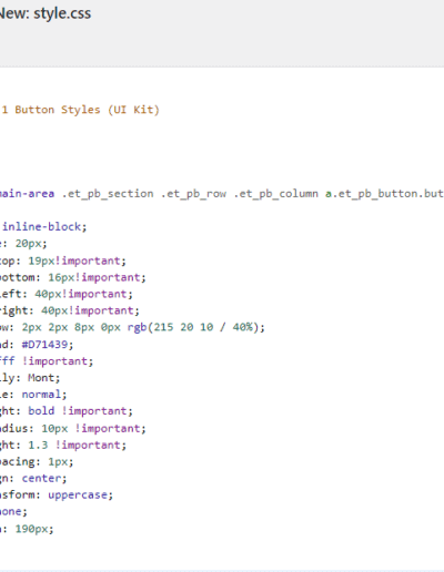
Define a CSS Class for each of your design elements, say, one for each button. This will allow you to quickly attribute specified UI elements to pages with quick-keys, making design work easier overall.
CSS class is used to define a group of HTML elements so that unique styling may be applied and formatted to those elements with a CSS, or class selector.
3.Avoid Using Page Builder Design Tools for Every Element
Avoid using available visual page builders for every design element since:
- If you want to update a button across your entire site, you have to do it manually with the visual builder, and
- If a page has identical UI elements, the visual builder will load each instance of the code individually, whereas styling in child theme will enable the code to load only once.
Examples of visual design tools you want to limit your use of include Elementor, Beaver Builder, Divi, WP Bakery.
“For example, in Elementor or Divi you can style buttons with their in-page design tool except in unique instances where only a single, unique button appears: instead you should put that button’s code in CSS class, and select that class setting anytime you want the button to appear. This will set all their styling the same.”
– Pol Cousineau, The Digital Navigator
Ready to Systemize Your UI Design Efforts?
Whether you blasted through this article series, or have been slowly cultivating your UI design plans, we hope we’ve given you some critical insight on how a UI design kit can ultimately decrease design costs and make website design much simpler.
We’ve discussed the building blocks for a great UI kit, and how to create one for yourself or to hand off to a designer.
We’ve talked about how to use your new UI kit to create UI mockups for implementation and coding, and now you should be ready to systemize these design efforts so you have time to focus on other website elements (payment processing anyone?).
Perhaps you’ve gotten to this point though and you’re ready for some serious convenience with the whole process.
It’s true that great design comes at a cost, but when the result is more sales, more leads, and a website you can be proud of, we know the price is always right.
That’s why if you’re ready to chat about getting help with UI design, we want to invite you to reach out for a free consultation. We’ll explore your website, and give you some actionable next steps on where we think you could improve your design aims.
Until then, we can’t wait to see what kind of UI design kit you create, and wish you the best in your design creation.
This post is part 4 of 4 in our guide on How to Use a UI Kit for the Best User Experience | Web Design Principles. Click here to read Part 1: Your UI Kit: The Building Blocks for All Website Designs, Part 2: How to Use a UI Kit for the Best User Experience | Web Design Principles, or here to read Part 3: UI Elements: Logo Placement, Sliders, and Forms | How to Use a UI Kit.
FAQ
What is a UI Mockup?
How can I make a UI mockup?
What kinds of tests do I need to iterate my live homepage?
How can I get user feedback for my UI mockup?
Want to know how to use a UI design kit for your website building blocks? Below we discuss the basics of UI kits (the building blocks for all designs!) to make sure your website stays looking great.
“This post is part 1 of 4 in our How to Use a UI Kit for the Best User Experience | Web Design Principles ultimate guide.”
With UI kits being the building blocks for all designs, UI designers generally experience challenges when using UI kits to build points, icons, and typographic elements–but you don’t have to!
Using a UI kit can actually make website building really simple, just like choosing ingredients on a pizza.
For instance, you can create customized blocks with various UI elements the same way you would personalize a pizza with your desired base and toppings. Plus…they’ll remember your order for next time!
In short, UI Kits or User Interface Kits provide clear simple instructions on the design elements of your website, email and online assets to ensure a consistent brand experience.
Table Of Content
- Introduction
- What is a UI Mockup? | UI Design
- How to Make a UI Mockup Design | 4 Steps to Website Mockup Design
- Should I Test My Live Homepage?
- What kind of tests do I need for my website homepage?
- How to Get UI Feedback for your Website Mockup Design
- How to Save Time and Decrease Design Costs with UI Mockup
- Digital Prototyping for UI Mockups & Implementation
- 3 Coding Tips for Great Website Mockup Design | Website Mockup Examples
- Ready to Systemize Your UI Design Efforts?
- FAQ
However, if you don’t use a UI kit, over time your website will become inconsistent, and might end up looking like Frankenstein’s monster!
To help you make the best use of your kit (and to keep customer’s trust high), here is a quick guide to help you answer all your questions about UI kits.
You’ll learn: What are the elements of design? Plus, we’ll explore how the professionals use UI kits to build amazing websites!
What is UI design?
User Interface (UI) design is a complete graphical layout of a website, web app, or application. Whether it’s images, blocks, or CTA buttons, UI includes all the elements that a visitor sees on your web pages.
The user interface (UI) determines various elements of a website, including screens, buttons, toggles, and colors. However, user experience (UX) reflects how a user interacts with UI design to access the desired content on your website.
The primary motive of UI design is to enhance the user experience (UX) of visitors in both desktop and mobile applications, and provide consistency between branding guidelines.
That’s because a great user experience results in more sales, while a robust UI Kit decreases web development costs.
Creating a UI kit therefore involves the process of designing the UI of your website to enhance UX functionalities like usability, accessibility, and customer interactions. These are the building blocks for all designs
Basic UI elements you should become familiar with include child themes (which replicate parent themes from your UI set), fonts, font sizes, button shapes, and colors that improve website interactivity for a better user experience.
What is good UI?
Together, these UI elements work together to make your website easy to understand and navigate. Good UI means users know where to click, where to fill in details, and that all pages across your site are consistent–rather than a monster of a website with different parts sewn together.
What is a UI Kit? | Basic Building Blocks for Web Design
A UI design kit is a complete bundle full of various graphic files, documentation, HTML/CSS files, UI elements, and components that make up the design of your website.
As its name describes, a UI kit is like a toolbox in which you have everything in one place.
The kit comes with pre-installed UI templates and the UI elements you require to design a great website. It also speeds up your ability to implement and change font families or button styles across your whole website.
Imagine you are a regular at the local pizzeria, but they keep changing what ingredients they carry. That’s how UI design works without a UI kit! You have to assimilate different UI elements again and again.
This process can become overwhelming for business owners across every industry. That’s why we recommend the use of a UI kit that enables you to choose your UI elements once, and synchronize them for further brand changes and updates.
Be careful though, as UI Kit is an industry term that describes a User Interface (design) kit, not simply these UI elements on their own. You can build a great UI design, but all great designs start with a great UI kit.
“When we design simple UI kits for client websites, we also share the file with the client’s team, as most don’t have a spare $20K laying around to pay for a full company branding UI kit.”
– Pol Cousineau, The Digital Navigator
In short, a great UI kit allows you to create functional UI mockups, and to place desired UI elements for an improved user experience–without having to go through a ton of repetition when writing new code.
3 Advantages of Using a UI Kit for Your Website
Not only does this process keep your website looking professional, but it also boosts user experience of your site. The added bonuses of using a UI Kit for your website design include: higher consistency, cost and time savings, reduced bounce rates, and increased ROI.
Higher Consistency
No doubt you can pull and combine UI elements from multiple libraries to create branded visual designs. But as you mess with several libraries and files, your UI elements can become inconsistent. UI Kits therefore offer a consistent approach, as they contain all the UI components you want in one place.
This is also helpful if you have a large team working on different pages of the same website: the UI kit acts as a main source for all UI elements, meaning all pages will end up matching all other pages created in the past.
Saves Time and Money
Your UI design kit has a model-view architecture with pre-installed templates and UI elements. It means you don’t need to utilize your time and effort to develop the elements from scratch. Just choose, customize, create a mockup, and implement to reduce friction and create a coherent design.
Increased Profitability
There’s no requirement for high-level coding to design a UI kit, meaning UI kits offer the highest ROI for business owners, thanks to time and cost savings.
That said, if you want a truly profitable option for personalized website development and UI, we recommend consulting professional website services like The Digital Navigator.
What’s in a UI design kit? | The Building Blocks for All Designs
For basic UI design kits that contain the building blocks for all designs, you will likely enjoy access to hierarchy elements of website building, such as text and buttons. The final file for a standard website project thus includes:
- The UI Kit itself (exported to website owner)
- Testing Layer (which shows how the ingredients come together)
At The Digital Navigator, we save clients even more time by creating home page designs in the same step, meaning a basic UI kit from us will come with home page design as well.
That being said, higher-budget projects call for more advanced UI kits, which include more design elements. We can’t speak for other web design services, but our advanced UI design kits include for example:
- Testimonials
- Bullet and Button selection
- Toggles
- Radio buttons
- Icons & Image styles
- Forms
Where Can I Get a UI Kit?
The best way to get a UI kit is to consult website designers and app designers. Also, some developers may design brand boards and mood boards for branding purposes that you can buy in a ‘kit’ format.
Nevertheless, these boards may just look like a prospectus with your brand logo, information about the product, and colorful graphics. There’s no inclusion of buttons that you need for lead generation and conversions. That’s why we recommend you contact a trusted website designer or app designer to get a complete UI kit.
How to find a good web designer for a UI Kit: If you’re unsure which web designer would be right for you, you can always read google reviews and explore different sections of the designer’s website to see how well their website design functions when live.
How to Create a Basic UI Design Kit
Now that you know the basic building blocks that go into a functional UI Kit, it’s time to start creating your own. This option is best for those who don’t plan to scale their website past a few pages, but still want to create a sense of consistency throughout.
If on the other hand you opt to hire a web designer or purchase a UI kit outright, you will need to complete these steps before you hire the right person–unless you find an option that creates a UI kit for you, like The Digital Navigator.
Then we’ll explore the way we create UI kits for our clients so you’ll really know what to expect when you make your final decision.
Initial DIY steps are fairly simple to create a UI design kit: first you research your ideal design style, then you choose your branded font, then you select and customize other UI elements to your liking.
1. Research your ideal design style:
Before you start using a UI design kit as the basic building block of a visual design, you must have an idea of what you want your design to look like. This is the first and most basic element of design.
Here, we recommend you explore competitor websites and save the URLs of websites with your ideal design styles for later.
Suppose for example, you want to create the basic building blocks for your learning management system (LMS). You can explore the websites of your competitors and see the color combination, blocks, sections, and fonts they use.
Think about the look and feel you want: is it more funny and soft and smooth and curvy (e.g. more pill shaped buttons and Serif or even handwriting type fonts) or is it conservative / financial / professional (blacks, blue, sharper button corners, etc.)?
Then, once you get an idea of UI design, you can begin to customize your own according to your unique needs and service offerings.
2. Choose a branded font:
Font is the first and most basic element of design that highly impacts the user interaction and overall experience of your business website.
Just make sure you add text options according to the different header hierarchies you want on-page. (You’ll likely be choosing from H1 to H6, plus paragraph text).
We often recommend Google Fonts to about 95% of our clients since there are over 900 font options to choose from–you can always find one that aligns with the feel and look of your brand.
If you look at TDN’s website, we use a paid font, “MONT” which is easy to read and stays consistent with our UI design elements.
3. Select and Customize UI elements:
After you choose a font, you must select and customize other UI elements like colors, buttons, button shapes, and more. Remember to begin with high-priority design elements that relate directly to your services and sales, such as ‘buy now’ or ‘read more’ buttons.
Coding these disparate elements may require the help of a designer, particularly if you plan to add three or more additional UI elements beyond simple buttons and fonts. The more design elements you add, the higher chance of error during the DIY approach.
PS: Part Two of this article series, titled “Top 2 User Interface Design Elements for Your Website” provides some added insight on how to choose the best UI elements for your business.
Our UI Kit Process | The Digital Navigator
Here’s a behind-the-scenes look at how we put together UI kits for our top-performing clients across a variety of industries.
1. Clients fill out a basic intake form and we create design concept
First clients fill out a basic intake form to help us gain insight into their design vision for their brand. Then we create a first concept with different iterations and variations through Figma based on this intake form.
2. Meet with client to present proposed design through Figma
Next we meet with our clients to present our thoughts and designs in real-time, and make changes to the design live while on video conference. Together we change colors, fonts, sizes, and other elements as needed.
If disagreements occur, we have a third time’s the charm policy: we will share our opinion on a given feature twice, but if a client insists on their own option a third time we go along with it.
3. Review and perfect UI elements
Based on meeting notes and changes, during the same meeting we are able to provide a test layer at this point–since updates are in real-time. That way, clients can interact with the different elements before the final round of review.
4. UI Kit is approved and homepage is designed
Once all basic building blocks have been approved by the client, the Digital Navigator designs the homepage in Figma. This page is then shared with clients and another real-time meeting is booked to take notes on the design file or make changes during the session.
Note that it is not uncommon for a client to want to change basic elements like font or color when they see it mocked-up on a homepage–that’s what this step is for! Once the homepage meets final approval with all needed design elements in place, we can begin coding that page into WordPress.
5. Create other page mock-ups in WordPress
With the homepage acting as a basis for other page designs, we then code other page mock-ups directly in WordPress based on the UI kit we’ve created for all UI elements (that we export to clients).
Some clients are willing to pay more for design at this stage, and prefer all pages mocked in Figma first–but we leave that to the owner’s discretion.
Figma or WordPress for UI Kits?
Based on our experience, Figma is more expensive, but you end up with a slightly better design finish due to all the extra attention during each design phase, and the rounds of extensive feedback.
On the other hand, WordPress is much less expensive, with design functionality at about 85% of what Figma can do. Most businesses don’t want to invest in Figma for that reason, so be sure to weigh your options before committing to the process.
How to Optimize Your UI Design Kit for the Best Mobile UX
Whether it’s desktop or mobile, cross-platform UI optimization is necessary if you want to enhance the user experience. You must design the UI with font size, color, and other UI elements that are adaptable to both desktop and mobile platforms.
For instance, at TDN, we develop a code for font size and button size to make them accessible on every platform. For instance, our developers reduce header sizes by 40% in mobile views when compared to our desktop site.
Based on the successes we’ve witnessed in the UX performance of client websites, we’ve come up with five ways that you can optimize your UI design kit for a flawless, responsive mobile experience.
5 Ways to Optimize Your UI Kit for Mobile
Scalable Text:
Text should be written and not placed on images because images will scale and the text can become tiny by contrast. People with screen readers also won’t be able to read the text if it is inside an image and search engines can’t read it–meaning you’ll have reduced accessibility for your site as well
Proper Spacing:
It’s necessary to maintain plenty of space between various UI elements for better UX. If you include buttons that are too close, or form fields without enough space, they will be difficult to use. If you maintain a proper space, your website will become really easy to use and will better engage the targeted user.
Optimize Navigation Menu:
You should optimize the navigation menu of your website to work on the cross-platform, including desktop, tablet, and mobile. Ideally, you want to reduce scenarios where the user is forced to scroll, as this is a complex manoeuver on non-desktop devices.
Color Contrast:
Static or inappropriate color contrast may lead to difficulties for a user while reading the content. Especially if the user is using your website outdoors or has some visibility concerns, your website will become really difficult to access and lead to a poor user experience.
Prompt for Missing Element:
When we fill multiple sections of a registration form, it’s common to skip some important sections. Here you can try to implement a user prompt that warns an individual to complete all the sections before proceeding further or clicking away from the page. Opt for prompts that tell your users what fillable information they’re missing.
The Fundamental Building Blocks of Application User Interfaces
Now that you’re in a better place to understand the building blocks for all designs, you know how a professional UI design kit will lead you towards web design success. Without a UI kit, you might end up with the wrong pizza every time you order.
That’s why we continue to say that a great UI kit is one of the fundamental building blocks of application user interfaces. Here we’ve given you a basic overview of UI kits and their advantages, but now it’s time to dig a little deeper into the effects each element can have on your site.
Click ahead to Part Two of this Article Series – Top 2 User Interface Design Elements for Your Website – for the best ways to build up your UI design kit for the best UI and UX around.
This post is part 1 of 4 in our guide on How to Use a UI Kit for the Best User Experience | Web Design Principles. Click here to read Part 2:How to Use a UI Kit for the Best User Experience | Web Design Principles, Part 3: UI Elements: Logo Placement, Sliders, and Forms | How to Use a UI Kit, or here to read Part 4: UI Mockups & Implementation to Decrease Design Costs.
0 Comments